Skip to content









Cosmetic packaging is judged before the customer ever opens the product. Surface finish plays a major role in that first impression, but selecting a finish is not simply a matter of choosing between matte and gloss.
The finish affects how colors appear, how fingerprints and scuffs show, how the carton feels in the hand, and how premium the packaging looks under retail lighting. It can also influence production complexity and the final packaging cost.
In my experience reviewing cosmetic packaging specifications, brands often choose a finish based on a digital mockup without considering how the same treatment will behave on the actual substrate. A matte coating can soften the appearance of saturated colors. A gloss surface can increase visual contrast but reveal handling marks more easily. Soft-touch finishes can create a premium tactile effect, while foil stamping introduces additional tooling and registration considerations.
For cosmetic brands, the right finish should therefore be selected as part of the complete packaging specification, not as an afterthought.
Quick Answer: Which Finish Is Best for Cosmetic Packaging?
There is no single finish that works best for every cosmetic product.
The appropriate choice depends on the brand position, substrate, artwork, handling conditions, desired tactile experience, and production budget.
| Finish | Visual Character | Tactile Feel | Best For |
| Matte | Subtle, refined | Smooth, low-reflective | Minimalist and modern brands |
| Gloss | Bright, reflective | Smooth | Bold graphics and high-color impact |
| Soft Touch | Premium, muted | Velvety | Luxury skincare and cosmetics |
| Foil Stamping | Metallic, high-contrast | Raised/pressed detail depending on process | Premium accents and luxury branding |
A combination can also be more effective than using one finish across the entire carton. For example, a matte surface with selective gloss or foil can create contrast without making the package visually excessive.
What This Guide Covers
This article examines the production and design considerations behind four widely used cosmetic packaging finishes:
- Matte finishes
- Gloss finishes
- Soft-touch finishes
- Foil stamping
We will compare their visual characteristics, tactile performance, production considerations, and cost implications so packaging buyers can make a more informed specification decision.
Matte Finish: Clean, Modern & Understated
Matte finishes reduce surface reflectivity and create a softer visual appearance than high-gloss surfaces.
For cosmetic packaging, this can be particularly effective when the brand wants a restrained, contemporary presentation. Matte surfaces are commonly associated with minimalist skincare, premium wellness products, natural cosmetics, and modern beauty brands.
The benefit is not only aesthetic.
A low-reflective surface can make printed information easier to view under certain lighting conditions because there is less direct glare from the carton.
When Matte Works Well
Matte finishes can be particularly suitable for:
- Minimalist cosmetic brands
- Skincare packaging
- Natural and botanical product lines
- Neutral or muted color palettes
- Premium packaging with restrained graphics
- Brands emphasizing sophisticated rather than flashy presentation
However, matte does not automatically mean more premium.
The result depends on the substrate, artwork, typography, color selection, and finishing quality. A poorly balanced matte design can appear flat rather than sophisticated.
Matte and Color Reproduction
One production consideration is how the surface changes perceived color.
A highly saturated color can appear different when viewed on a low-reflective surface compared with a glossy one. This matters when a brand has established colors that need to remain visually consistent across different packaging components.
For repeat production, approve physical samples rather than relying entirely on a screen-based rendering.
Gloss Finish: High-Impact Color & Shine
Gloss finishes increase surface reflectivity and can make printed colors appear more vivid and visually prominent.
This can be useful for cosmetic brands that depend on strong color contrast, photography, gradients, or high-impact graphics.
Gloss is particularly effective when the packaging design is intended to attract attention under bright retail lighting.
Common Applications
Gloss finishes can work well for:
- Colorful cosmetic lines
- Makeup packaging
- Youth-focused beauty brands
- High-contrast graphic designs
- Product photography
- Bold branding systems
The trade-off is surface visibility.
Because gloss reflects more light, fingerprints, handling marks, and surface imperfections may be more noticeable depending on the material and application.
For packaging that will be handled frequently, the finish should therefore be evaluated under realistic conditions rather than judged only under controlled studio lighting.
Soft-Touch Finish: Premium Tactile Experience
Soft-touch finishing is different from simply choosing a matte appearance.
Its primary advantage is the tactile experience.
When a customer picks up a soft-touch carton, the surface can feel smoother and more velvety than a conventional printed carton. That tactile difference can support luxury positioning, particularly for skincare, fragrance, cosmetics, and premium wellness products.
Where Soft Touch Makes Sense
Consider soft touch when the brand wants to communicate:
- Luxury
- Sophistication
- Premium skincare positioning
- High-end gifting
- Tactile product differentiation
But there is a production consideration that should not be ignored: soft-touch finishing adds another layer to the packaging specification.
The substrate, printing, coating or film treatment, and final artwork need to be compatible with the selected production process.
A brand ordering at higher volumes should also confirm how the finish will perform during packing, transportation, shelf handling, and repeated contact.
Foil Stamping: Metallic Contrast & Luxury Appeal
Foil stamping creates metallic or specialty accents by transferring foil onto selected areas of the packaging.
Gold and silver are common choices, but specialty foils can also be used to achieve different visual effects.
Unlike a full-surface coating, foil is normally used selectively.
That makes it particularly valuable for emphasizing:
- Logos
- Brand names
- Product names
- Borders
- Decorative elements
- Small premium accents
A well-placed foil detail can make a relatively simple carton feel substantially more sophisticated.
The key is restraint.
If every graphic element receives foil, the visual hierarchy can disappear. Strategic contrast usually produces a stronger result.
Foil Stamping and Production Complexity
Foil stamping introduces additional production considerations compared with standard CMYK printing.
Artwork must identify the exact areas receiving foil, and the production team needs the appropriate tooling or stamping setup.
This becomes particularly important with fine typography, small decorative elements, and detailed logos.
Very fine foil details can be more challenging to reproduce consistently than larger, simpler elements. For this reason, physical sampling is especially valuable when a brand’s logo or primary visual identity depends heavily on foil stamping.
The Boxology’s Expert Insight
Do not select a cosmetic box finish from a digital mockup alone.
The same artwork can look noticeably different when reproduced on matte, gloss, soft-touch, or foil-finished packaging.
During a production review, compare physical samples under the lighting conditions where the package will actually be displayed. Check color density, glare, fingerprint visibility, logo contrast, tactile feel, and the relationship between the finish and the substrate.
A finish should support the packaging design—not compensate for weak artwork or an unsuitable material specification.
Matte vs Gloss vs Soft Touch vs Foil Stamping
Choosing a finish becomes easier when the packaging is evaluated as a production system rather than as a visual preference.
Each finish solves a different problem. Matte controls reflectivity. Gloss increases visual intensity. Soft touch adds tactile differentiation. Foil creates concentrated visual emphasis.
The correct decision depends on what the packaging needs to accomplish.
| Finish | Setup Complexity | Visual Impact | Tactile Experience | Cost Effectiveness |
| Matte | Low–Medium | Refined | Smooth | High |
| Gloss | Low–Medium | High | Smooth | High |
| Soft Touch | Medium | Premium | Velvety | Medium |
| Foil Stamping | Medium–High | Very High | Premium accent | Medium |
| Matte + Foil | High | Luxury | Refined + metallic | Medium |
| Matte + Spot Gloss | High | High contrast | Mixed | Medium |
The table highlights an important sourcing point: the most expensive finish is not automatically the best finish. If the packaging concept depends on a restrained aesthetic, a well-executed matte surface may outperform a complex combination of specialty treatments.
Conversely, a luxury fragrance carton may benefit from a higher-cost foil or soft-touch treatment because the packaging itself is part of the perceived product value.
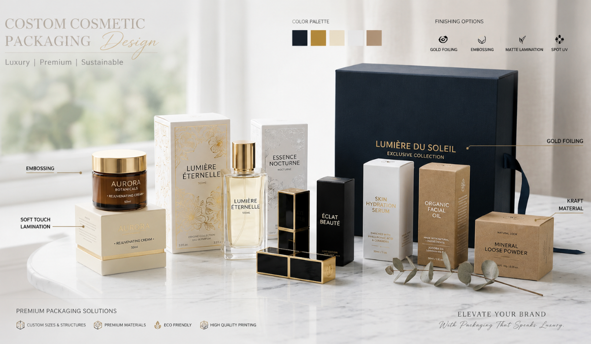
These finishing options can be incorporated into custom cosmetic boxes to create the desired visual and tactile experience.
How Cosmetic Box Finishes Affect Production
Finish selection should happen before the final dieline and artwork are approved.
Once the production specification is locked, changing the finishing process can affect artwork preparation, material selection, production sequencing, and overall cost.
Substrate Compatibility
The underlying board has a direct effect on the finished appearance.
A coated paperboard surface can produce a different visual result from an uncoated or textured substrate. For premium cosmetic cartons, SBS paperboard is frequently considered when clean print reproduction and a smooth surface are priorities.
If the brand is using kraft or another naturally textured board, the final finish should be tested against the board’s natural color and surface characteristics.
This is particularly important for light colors, metallic effects, and fine typography.
Artwork Registration
Foil, spot gloss, embossing, and other specialty processes require accurate registration against the printed artwork.
A logo that is slightly misregistered may be acceptable on a simple printed carton but become much more noticeable when a metallic foil border is supposed to align precisely with the printed artwork.
For production artwork, clearly separate finishing layers and provide the converter or manufacturer with an unambiguous specification.
Fine Details
Small text and extremely thin decorative lines deserve additional attention.
A complex finishing specification can increase production sensitivity when artwork contains very fine details. What looks perfect at large scale on a computer monitor may not reproduce with the same consistency on a physical carton.
For that reason, brands using foil stamping or multiple specialty treatments should request a physical proof or production sample before approving a large run.
How Finish Selection Affects Packaging Cost
Packaging buyers sometimes compare finishes using only the apparent per-unit difference.
That approach can be misleading.
The actual cost structure can involve:
- Additional tooling
- Setup charges
- Extra production stages
- Specialty materials
- Higher inspection requirements
- Increased production time
- Minimum order quantities
- Additional finishing waste
- Longer production lead times
Foil stamping is a good example.
The foil itself is only one part of the specification. The production process may also involve stamping tooling and an additional finishing operation. If the design uses several foil colors or multiple intricate areas, setup requirements can increase.
Soft-touch treatment can similarly add cost compared with a standard printed matte carton.
The Better Procurement Question
Instead of asking:
“Which finish is cheapest?”
Ask:
“Which finish delivers the required brand effect at the lowest practical total packaging cost?”
That distinction matters when purchasing thousands of cartons.
A premium finish that meaningfully improves shelf presentation may justify its cost for a high-margin skincare product. For a lower-priced product with aggressive packaging-cost targets, a simpler matte or gloss treatment may provide a better return.
Choosing a Finish Based on Cosmetic Product Positioning
Different cosmetic categories naturally lend themselves to different visual treatments.
Skincare
Skincare brands often benefit from restrained finishes.
Matte and soft-touch surfaces can work particularly well for minimalist formulations, clinical aesthetics, natural skincare, and premium facial-care products.
Neutral colors combined with subtle finishing can communicate sophistication without making the carton visually busy.
Makeup
Makeup packaging can tolerate stronger visual contrast.
Gloss finishes, metallic accents, vibrant color reproduction, and selective foil can help individual products stand out within a larger product range.
However, the finish should still follow the brand’s visual system. A highly reflective package may not suit a brand positioned around natural or understated beauty.
Fragrance
Fragrance packaging frequently provides more room for premium finishing.
Soft touch, foil stamping, embossing, specialty papers, and controlled contrast can be combined to create a more tactile unboxing experience.
Here, the packaging often contributes directly to perceived product value.
Natural & Organic Cosmetics
Natural brands may benefit from kraft textures, muted matte surfaces, subtle printing, or restrained specialty finishing.
The objective is usually to communicate authenticity and material quality rather than maximum visual reflectivity.
Matte + Foil vs Soft Touch + Foil
Two premium combinations deserve particular attention.
Matte + Foil
A matte surface provides a low-reflective background while the metallic foil creates a concentrated highlight.
This combination works well when a brand wants its logo or product name to become the visual focal point.
For example, a charcoal matte carton with restrained gold foil can create strong contrast without requiring extensive graphic decoration.
Soft Touch + Foil
Soft touch changes the tactile experience while foil provides the visual highlight.
This combination is particularly suitable for luxury cosmetic and fragrance packaging where the customer is expected to physically handle the carton before opening it.
The downside is cost and production complexity. Both treatments need to be specified correctly, and the finished sample should be evaluated for surface consistency and foil adhesion.
Common Cosmetic Packaging Finish Mistakes
Even experienced packaging buyers can run into avoidable finishing problems.
1. Choosing the Finish Before the Substrate
The board and surface treatment work together. Selecting a finish first and trying to force it onto an unsuitable substrate can produce disappointing results.
2. Using Too Many Specialty Effects
Foil, embossing, gloss, texture, and metallic printing can all look attractive individually. Combining everything can destroy visual hierarchy.
Premium packaging often relies on controlled contrast rather than maximum decoration.
3. Ignoring Handling Conditions
A finish that looks excellent in a studio photograph may behave differently during fulfillment, transportation, and retail handling.
Consider fingerprints, scuffing, abrasion, moisture exposure, and stacking before final approval.
4. Approving From Screenshots Alone
Color and surface appearance are difficult to judge accurately from a monitor.
A physical sample gives the packaging team an opportunity to inspect:
- Actual surface reflectivity
- Color density
- Foil contrast
- Tactile feel
- Print registration
- Edge quality
- Surface imperfections
5. Failing to Specify Finishing Layers
Production artwork should clearly identify where foil, spot gloss, embossing, or other treatments are required.
Ambiguous artwork creates unnecessary questions during prepress and can increase revision cycles.
The Boxology’s Expert Insight
Use contrast strategically.
When reviewing a premium cosmetic carton, I would rather see one strong finishing interaction than five competing effects.
A matte substrate with a precisely registered foil logo can create more perceived value than a carton covered in metallic effects. Likewise, selective gloss on a soft-touch or matte surface can direct the customer’s eye toward one important graphic element.
From a manufacturing perspective, fewer finishing operations also mean fewer variables to control during production.
The strongest luxury packaging specification is often the one where every finishing process has a defined purpose.
How to Choose the Right Cosmetic Box Finish
Before approving a finishing specification, run through this checklist:
- Brand positioning: Is the brand minimalist, luxury, natural, clinical, playful, or premium?
- Product category: Does the finish complement skincare, makeup, fragrance, or another cosmetic segment?
- Substrate: Is the selected board compatible with the desired surface treatment?
- Artwork: Will the finish improve the visual hierarchy or simply add decoration?
- Handling: Will the package experience frequent contact or abrasion?
- Production: Does the finish introduce additional tooling or finishing stages?
- Budget: Does the visual benefit justify the additional cost?
- Sampling: Has the physical finish been tested on the actual carton construction?
A good finish should survive this checklist before it reaches mass production.
Final Takeaway
Matte, gloss, soft touch, and foil stamping each create a different combination of visual and tactile performance.
Matte is controlled and understated.
Gloss delivers stronger reflection and color impact.
Soft touch adds a premium tactile layer.
Foil stamping creates concentrated metallic emphasis.
The right choice depends on the cosmetic product, brand positioning, substrate, handling environment, artwork, and production budget.
For packaging buyers, the most reliable approach is to define the desired customer experience first and then select the finishing process that can deliver it consistently at production scale.
A physical sample should be part of that decision whenever the finish is central to the packaging concept.
Recommended CTA
Need help selecting the right finish for your cosmetic packaging? The Boxology.US can help you evaluate substrate, finishing options, artwork requirements, and production considerations before you commit to a larger run. Contact our packaging team for a free structural sample review, layout test, or expert design consultation.