Skip to content


Why Kraft Mailer Boxes are the New Standard for US Retailers
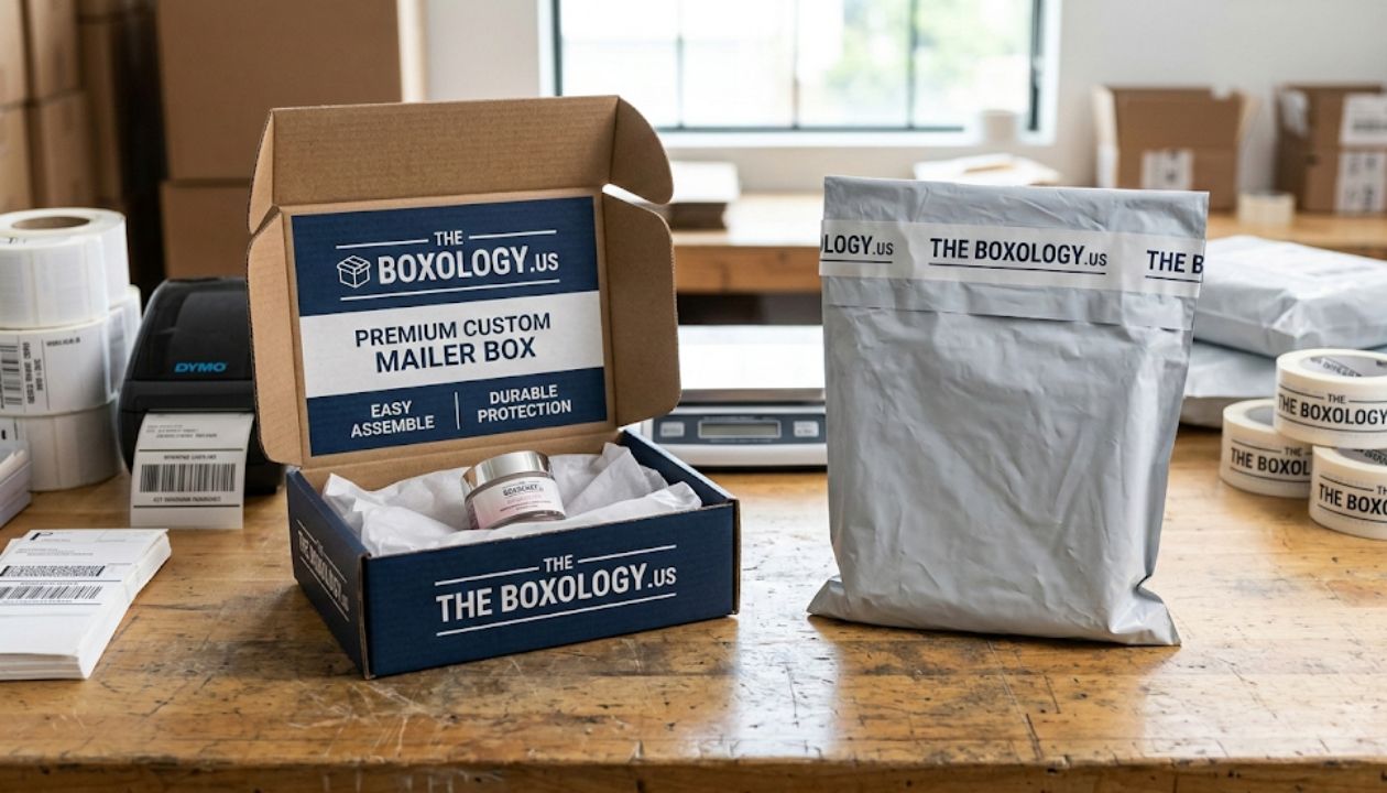
In the world of e-commerce, the first physical touchpoint you have with a customer isn’t your product it’s the box it arrives in. While flashy, gloss-coated plastic was once the standard, the industry has shifted. Kraft mailer boxes are now the gold standard for brands that value a grounded, honest, and sustainable aesthetic.
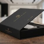
At The Boxology.US, we’ve seen thousands of businesses move toward corrugated cardboard solutions not just for the environmental benefits, but because the raw, tactile nature of recycled paperboard provides a canvas that feels premium without trying too hard. However, a plain brown box can sometimes feel unfinished.
If you want to stand out in a crowded marketplace, you need to elevate your Kraft mailer boxes from simple shipping containers to brand ambassadors. Here is how you do it effectively.
10 Ways to Elevate Your Branding

1. Leverage the Power of Minimalist Ink
What most businesses overlook is that Kraft mailer boxes absorb ink differently than white or coated boards. Instead of fighting the texture, lean into it. Using a single-color, high-contrast black ink for your logo creates a “woodblock” print effect that looks sophisticated and expensive. Soy-based inks are particularly effective here, as they soak into the biodegradable mailing boxes to create a matte finish that screams authenticity.
2. Introduce Custom Corrugated Inserts
A product rattling around inside a box feels cheap. Beyond protection, custom inserts made from the same e-flute thickness material as the box create a structured, “set-piece” feel. In my experience working with bulk manufacturers, a well-designed insert can often eliminate the need for extra bubble wrap or plastic fillers, keeping your entire kit 100% post-consumer waste compliant.
3. Play with Interior Printing
The “reveal” is the most critical part of the sustainable unboxing experience. While the outside of your Kraft mailer boxes might stay rugged and natural, the inside can tell a different story. Printing a hidden message, a pattern, or even your social handles on the interior flaps catches the customer off guard in the best way possible. It transforms a tuck-top mailer into a storytelling tool.
4. Use Texture as a Branding Element
Kraft paper isn’t just a color; it’s a texture. You can “pimp” your wholesale packaging solutions by adding a spot UV or a tactile varnish to specific areas. This creates a subtle play between the rough, earthy tones of the recycled paperboard and a smooth, slightly raised finish. It’s a detail that customers will feel before they even see it.
5. The Strategy of Custom Tape and Seals
If custom printed packaging isn’t in your budget for every side of the box, focus on the seal. A high-quality, water-activated paper tape or a self-sealing adhesive strip with your brand’s signature color provides a professional finish. It also reinforces the crush-resistant design of the box, ensuring the package remains sturdy throughout the e-commerce logistics chain.
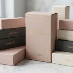
6. Embrace Earthy Color Palettes
You aren’t limited to just brown. Kraft mailer boxes come in various shades, from deep chocolate to light sand. Mixing these earthy tones with white screen-printed graphics offers a modern, “Scandi” look that is very popular with US-based lifestyle brands. This approach maintains the minimalist branding while ensuring your wholesale packaging solutions don’t look like everyone else’s.
7. Incorporate Functional Die-Cuts
A window or a custom-shaped cutout can provide a “sneak peek” at the product inside. When dealing with corrugated cardboard, you have to be careful not to compromise the structural integrity. However, a small, strategic die-cut on a tuck-top mailer can make the packaging feel interactive and high-end.
8. Add Value with Education
Since Kraft mailer boxes are inherently compostable mailers, tell your customers how to dispose of them. Including a small icon that says “I’m 100% Compostable” or “Garden Friendly” builds trust. Using FSC-certified materials isn’t just a checkbox; it’s a narrative that your customers want to be a part of.
9. QR Codes for Digital Integration
Keep your minimalist branding clean by moving the “fine print” to a QR code. A small, neatly printed QR code on the bottom of your Kraft mailer boxes can lead to a “How-to-use” video, a discount code for the next order, or your brand’s sustainability report. This bridges the gap between physical eco-friendly shipping supplies and your digital presence.
10. Seasonal Sleeves
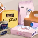
If you buy Kraft mailer boxes in bulk discounts, you might be stuck with the same look all year. A simple, digitally printed paper sleeve can be slipped over the box for holidays or special collaborations. It’s a cost-effective way to refresh your look without reordering your entire inventory of flat-packed shipping supplies.
Comparing Your Options: Kraft vs. Standard White Board

When deciding on your next order, consider how Kraft mailer boxes stack up against standard bleached white corrugated boxes:
| Feature | Kraft Mailer Boxes | White Corrugated Boxes |
| Sustainability | High (Often 100% Recycled) | Medium (Requires Bleaching) |
| Durability | High (Longer Fibers) | High |
| Print Clarity | Best for Bold/Dark Colors | Best for Full-Color/CMYK |
| Cost | Usually Lower | Usually Higher |
| Customer Perception | Organic, Ethical, Premium | Clean, Clinical, Commercial |
| Moisture Resistance | Moderate | Slightly Higher (if coated) |
The Boxology’s Expert Insight

The Pro Tip: One thing I always tell our clients at The Boxology.US is to pay attention to “Grain Direction.” When ordering Kraft mailer boxes in bulk, ensure the corrugated fluting runs vertically against the opening side. This minor technical detail significantly increases the stacking strength of your lightweight shipping containers, preventing the dreaded “corner crush” during transit. It’s the difference between a box that looks tired and one that looks crisp upon arrival.
Logistics and Practicality
While aesthetics matter, your Kraft mailer boxes must perform. In the US, where packages often travel thousands of miles through various climates, the crush-resistant design is non-negotiable.
Many of our clients at The Boxology.US prefer low MOQ (Minimum Order Quantity) runs to test different e-flute thickness levels before committing to a massive wholesale packaging order. This ensures that the lightweight shipping containers actually hold up against the rigors of modern sorting facilities.
A Quick Branding Checklist:
- Is your logo placed where it won’t be covered by shipping labels?
- Does the matte finish of the ink complement the paper texture?
- Are you using FSC-certified materials to back up your green claims?
- Is the self-sealing adhesive strip strong enough for your product’s weight?
Final Thoughts

Upgrading your Kraft mailer boxes doesn’t require a massive budget; it requires intentionality. By focusing on the tactile experience the way the box opens, the smell of the paper, and the clever use of minimalist branding you create a lasting impression that plastic mailers simply cannot replicate.
If you are unsure which e-flute or wholesale packaging solutions are right for your specific product weight and dimensions, let’s chat. At The Boxology.US, we specialize in helping brands transition to sustainable unboxing experiences without sacrificing protection or style.
Ready to elevate your shipping game?
Contact us today for a Free Consultation on your packaging design. For all new partners, we are currently offering 25% off your first order to help you get your brand in the hands of your customers in the best way possible.